
Print Design Trends for 2026 (and what we’re seeing)
- CatPrint Team

- May 20
- 3 min read
Every year at CatPrint, we notice something pretty fun: design trends don’t just shift, they start feeling more personal. People aren’t just making “pretty prints” anymore. They’re making things that feel like them. Whether that’s wedding invitations, art prints, small business branding, or just something they’re excited to share.
So here’s what’s showing up everywhere in print design trends for 2026, and how people are actually bringing these ideas to life.


Texture is becoming the main character 🤲
Flat, basic cardstock is definitely taking a back seat. People want prints that feel like something. We’re seeing way more love for heavier, textured papers, like Cotton, Felt, Hemp textures, and anything that adds a little “wow, this feels different” moment when you hold it.
At CatPrint, people are mixing and matching paper styles depending on the vibe:
Soft cotton paper for romantic wedding suites
Felt texture for artsy, handmade energy
Heavy satin stocks for clean, modern branding
It’s less about what looks good on screen and more about what feels good in your hands.
Foil is still here… but it’s getting smarter ✨
Foil isn’t going anywhere, but in 2026, it’s way more intentional. Instead of covering everything in shine, it’s being used like a highlight. Something that guides your eye instead of overwhelming the design.
We’re seeing things like:
Couple names in Gold foil on wedding invites
One meaningful word on art prints
Subtle logo accents for small business stationery
Gold is still a classic, Silver feels clean and modern, and Iridescent foil is showing up in more playful, creative designs. It’s not about “more shine,” it’s about just enough shine in the right place.
Editorial layouts are everywhere right now 📰
If 2025 was minimal, 2026 is “minimal but with personality.”
Think magazine energy, but for everything:
Big, confident typography
Asymmetrical layouts
Lots of breathing room
Serif + sans-serif combos that somehow just work
We’re seeing a lot of this in wedding invitations printed, especially full suites, where each piece feels like part of a little visual story. Clean, but not boring. Intentional, but not stiff.
Color is getting softer (but more interesting) 🎨
Bright, overly saturated palettes are stepping back a bit. In their place? Colors that feel warm, lived-in, and easy on the eyes.
We’re seeing a lot of:
Warm neutrals (cream, sand, clay)
Dusty blues and muted greens
Soft pastels with a nostalgic feel
One thing we love is how our customers pair these softer palettes with bold typography or foil accents. It keeps everything feeling balanced and not too safe.
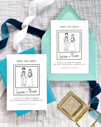
Imperfection is the aesthetic now ✍️
Perfect is officially out. Personality is in.
More designs are embracing:
Hand-drawn illustrations
Organic shapes and lines
Slightly uneven lettering
Collage-style layouts
It makes everything feel more human and, honestly, more fun. We especially see this in greeting cards, art prints, and small business branding, where personality matters just as much as polish.
Print is becoming an experience again 🎁
This is one of the biggest shifts we’re seeing overall.
People aren’t just designing single pieces anymore. They’re designing moments:
Invitation suites with multiple coordinated cards
Matching branding sets for small businesses
Art prints designed to be collected or gifted together
People don’t just want something printed, they want that little “opening it up” moment to feel special. And that’s what makes print so fun right now!
A little nostalgia, but make it modern 📼
There’s a soft wave of nostalgia happening, but it’s not literal throwbacks. It’s more like a feeling.
We’re seeing:
Vintage-inspired color palettes
Retro typography, but cleaned up
Familiar design styles with a modern twist
It feels like something you’ve seen before… but better!
The takeaway: Print is getting more personal 💛
If there’s one thing we keep seeing at CatPrint, it’s this:
People are designing for feeling first. Texture, foil, editorial layouts, soft color palettes, these aren’t just trends. They’re tools people are using to make something meaningful when it’s printed. Because once it’s in your hands, it’s not just a design anymore. It’s real.
Questions? Contact the experts.
Contact our Customer Service Team at support@catprint.com or call us at 877-228-7768.


Comments